Once upon a time...
...there was the an issue of Quiltmaker magazine lying around my house. A quilt appeared on its cover and I was determined to make one just like it.
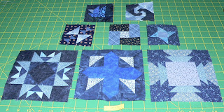
The magazine was dated May/June '00 No. 73. Yep, almost 13 years ago. The quilt pattern was titled Garden Patch and this is what it turned out to look like a few months later.

I didn't understand colors and the differences in color value when I first began my quilting experience. I still struggle at times with getting contrast and values to pop in my quilts. While this quilt looks decent enough, and we receive several comments on it when company visits, I wasn't completely happy with the dull personification it portrayed and wanted to update it a bit. Plus, it was my first ever paper piecing project and I really didn't know what the heck I was doing back then.
Here's the newly completed top. I just finished it last night, and while it's not quilted yet, I had to show the before and after pics of what a few years' experience and an understanding of color can mean, not to mention, more is better when paper piecing!

Just for giggles I pinned the two up side by side on my design wall to show the actual effect of color and value placement. This is the result.

Sometimes you just have to redo a quilt because you love it so much; it is no longer doing what it used to do for you. This was one of those quilts. Because everybody always comments on it when they come over it needed a facelift. Three days out of my life to recreate it was well worth the time investment.

I like the first one, it has a primitive feel. But, when comparing the two, the second really pops! Isn't it a great feeling to see the advances you have made?
ReplyDelete